%20--%3e%3csvg%20version='1.1'%20id='Layer_1'%20xmlns='http://www.w3.org/2000/svg'%20xmlns:xlink='http://www.w3.org/1999/xlink'%20x='0px'%20y='0px'%20viewBox='0%200%20120.17%2045.43'%20style='enable-background:new%200%200%20120.17%2045.43;'%20xml:space='preserve'%3e%3cg%3e%3cpath%20d='M32.33,0v16.13c0,2.21-0.42,4.3-1.26,6.26c-0.84,1.97-2,3.7-3.49,5.18c-1.49,1.49-3.2,2.65-5.15,3.49%20c-1.94,0.84-4.04,1.26-6.3,1.26c-2.21,0-4.3-0.42-6.26-1.26c-1.97-0.84-3.68-2-5.15-3.49c-1.46-1.49-2.62-3.21-3.46-5.18%20C0.42,20.42,0,18.34,0,16.13V0h6.41v16.13c0,1.34,0.25,2.62,0.76,3.82c0.5,1.2,1.2,2.24,2.09,3.13c0.89,0.89,1.92,1.58,3.1,2.09%20c1.18,0.5,2.44,0.76,3.78,0.76c1.34,0,2.62-0.25,3.82-0.76c1.2-0.5,2.24-1.2,3.13-2.09c0.89-0.89,1.58-1.93,2.09-3.13%20c0.5-1.2,0.76-2.47,0.76-3.82V0H32.33z'%20fill='%232563eb'%20/%3e%3cpath%20d='M50.4,0.14c2.26,0,4.36,0.42,6.3,1.26c1.94,0.84,3.66,1.99,5.15,3.46c1.49,1.46,2.65,3.17,3.49,5.11%20c0.84,1.94,1.26,4.04,1.26,6.3c0,2.21-0.42,4.3-1.26,6.26c-0.84,1.97-2,3.7-3.49,5.18c-1.49,1.49-3.2,2.65-5.15,3.49%20c-1.94,0.84-4.04,1.26-6.3,1.26h-9.72v12.96h-6.41V16.27c0-2.26,0.42-4.36,1.26-6.3c0.84-1.94,1.99-3.65,3.46-5.11%20c1.46-1.46,3.18-2.62,5.15-3.46C46.1,0.56,48.19,0.14,50.4,0.14z%20M54.22,25.31c1.2-0.5,2.24-1.2,3.13-2.09%20c0.89-0.89,1.58-1.93,2.09-3.13c0.5-1.2,0.76-2.47,0.76-3.82c0-1.34-0.25-2.6-0.76-3.78c-0.5-1.18-1.2-2.21-2.09-3.1%20c-0.89-0.89-1.93-1.58-3.13-2.09c-1.2-0.5-2.47-0.76-3.82-0.76c-1.34,0-2.6,0.25-3.78,0.76c-1.18,0.5-2.21,1.2-3.1,2.09%20c-0.89,0.89-1.58,1.92-2.09,3.1c-0.5,1.18-0.76,2.44-0.76,3.78v9.79h9.72C51.74,26.06,53.02,25.81,54.22,25.31z'%20fill='%232563eb'/%3e%3cpath%20d='M94.03,20.95l4.54,4.54l-2.23,2.23c-1.54,1.54-3.29,2.71-5.26,3.53c-1.97,0.82-4.03,1.22-6.19,1.22%20c-2.16,0-4.22-0.41-6.19-1.22c-1.97-0.82-3.72-1.99-5.26-3.53c-1.58-1.58-2.76-3.37-3.53-5.36c-0.77-1.99-1.15-4.02-1.15-6.08%20c0-2.06,0.38-4.08,1.15-6.05c0.77-1.97,1.94-3.74,3.53-5.33s3.37-2.77,5.36-3.56c1.99-0.79,4.02-1.19,6.08-1.19%20c2.06,0,4.09,0.4,6.08,1.19c1.99,0.79,3.78,1.98,5.36,3.56l2.23,2.23L80.64,25.06c1.82,0.91,3.75,1.21,5.8,0.9%20c2.04-0.31,3.83-1.24,5.36-2.77L94.03,20.95z%20M77.98,9.36c-1.92,1.92-2.88,4.22-2.88,6.91c0,1.49,0.33,2.9,1.01,4.25%20c0.58-0.58,1.45-1.45,2.63-2.63c1.18-1.18,2.42-2.42,3.74-3.74c1.32-1.32,2.59-2.58,3.82-3.78c1.22-1.2,2.17-2.14,2.84-2.81%20c-1.83-0.91-3.76-1.22-5.8-0.94C81.3,6.91,79.51,7.82,77.98,9.36z'%20fill='%232563eb'%20/%3e%3cpath%20d='M120.17,0v6.41h-3.24c-1.35,0-2.61,0.25-3.78,0.76c-1.18,0.5-2.21,1.2-3.1,2.09c-0.89,0.89-1.58,1.92-2.09,3.1%20c-0.5,1.18-0.76,2.44-0.76,3.78v16.2h-6.48v-16.2c0-2.26,0.42-4.36,1.26-6.3c0.84-1.94,2-3.65,3.49-5.11%20c1.49-1.46,3.21-2.62,5.18-3.46c1.97-0.84,4.06-1.26,6.27-1.26H120.17z'%20fill='%232563eb'/%3e%3c/g%3e%3c/svg%3e)
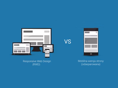
With the rise of mobile traffic, every website must be adapted to smaller screens. The two main approaches are dedicated mobile version and Responsive Web Design (RWD).
Dedicated Mobile Version
A separate site at an address like m.example.com or example.com/mobile.
Advantages
- Full control over the mobile version
- Ability to simplify content
- Faster loading (fewer resources)
Disadvantages
- Two separate systems to manage
- Double work for updates
- SEO problems (duplicate content)
- Need for redirects
Responsive Web Design (RWD)
One website that automatically adapts to screen size.
Advantages
- One URL - better for SEO
- One CMS to manage
- Automatic adaptation to all devices
- Easier maintenance
Disadvantages
- All resources loaded on every device
- More complex CSS
- Requires thoughtful design from the start
Comparison
| Aspect | Mobile Version | RWD |
|---|---|---|
| URL | m.example.com | example.com |
| SEO | Problematic | Optimal |
| Management | 2 systems | 1 system |
| Performance | May be better | Depends on implementation |
| Maintenance Cost | Higher | Lower |
CSS Units for RWD
Instead of fixed pixels, use relative units:
/* Instead of */
font-size: 16px;
width: 960px;

/* Use */
font-size: 1em;
width: 100%;
max-width: 60rem;
Mobile Traffic Statistics
Currently, over 50% of internet traffic comes from mobile devices. Android is the dominant system.
Recommendation
RWD is the better choice for most projects:
- One codebase to maintain
- Better SEO
- Ready for future devices
- Lower long-term costs
Summary
Responsive Web Design has become the industry standard. Dedicated mobile versions only make sense in specific cases, such as applications with drastically different functionality on mobile and desktop.

