%20--%3e%3csvg%20version='1.1'%20id='Layer_1'%20xmlns='http://www.w3.org/2000/svg'%20xmlns:xlink='http://www.w3.org/1999/xlink'%20x='0px'%20y='0px'%20viewBox='0%200%20120.17%2045.43'%20style='enable-background:new%200%200%20120.17%2045.43;'%20xml:space='preserve'%3e%3cg%3e%3cpath%20d='M32.33,0v16.13c0,2.21-0.42,4.3-1.26,6.26c-0.84,1.97-2,3.7-3.49,5.18c-1.49,1.49-3.2,2.65-5.15,3.49%20c-1.94,0.84-4.04,1.26-6.3,1.26c-2.21,0-4.3-0.42-6.26-1.26c-1.97-0.84-3.68-2-5.15-3.49c-1.46-1.49-2.62-3.21-3.46-5.18%20C0.42,20.42,0,18.34,0,16.13V0h6.41v16.13c0,1.34,0.25,2.62,0.76,3.82c0.5,1.2,1.2,2.24,2.09,3.13c0.89,0.89,1.92,1.58,3.1,2.09%20c1.18,0.5,2.44,0.76,3.78,0.76c1.34,0,2.62-0.25,3.82-0.76c1.2-0.5,2.24-1.2,3.13-2.09c0.89-0.89,1.58-1.93,2.09-3.13%20c0.5-1.2,0.76-2.47,0.76-3.82V0H32.33z'%20fill='%232563eb'%20/%3e%3cpath%20d='M50.4,0.14c2.26,0,4.36,0.42,6.3,1.26c1.94,0.84,3.66,1.99,5.15,3.46c1.49,1.46,2.65,3.17,3.49,5.11%20c0.84,1.94,1.26,4.04,1.26,6.3c0,2.21-0.42,4.3-1.26,6.26c-0.84,1.97-2,3.7-3.49,5.18c-1.49,1.49-3.2,2.65-5.15,3.49%20c-1.94,0.84-4.04,1.26-6.3,1.26h-9.72v12.96h-6.41V16.27c0-2.26,0.42-4.36,1.26-6.3c0.84-1.94,1.99-3.65,3.46-5.11%20c1.46-1.46,3.18-2.62,5.15-3.46C46.1,0.56,48.19,0.14,50.4,0.14z%20M54.22,25.31c1.2-0.5,2.24-1.2,3.13-2.09%20c0.89-0.89,1.58-1.93,2.09-3.13c0.5-1.2,0.76-2.47,0.76-3.82c0-1.34-0.25-2.6-0.76-3.78c-0.5-1.18-1.2-2.21-2.09-3.1%20c-0.89-0.89-1.93-1.58-3.13-2.09c-1.2-0.5-2.47-0.76-3.82-0.76c-1.34,0-2.6,0.25-3.78,0.76c-1.18,0.5-2.21,1.2-3.1,2.09%20c-0.89,0.89-1.58,1.92-2.09,3.1c-0.5,1.18-0.76,2.44-0.76,3.78v9.79h9.72C51.74,26.06,53.02,25.81,54.22,25.31z'%20fill='%232563eb'/%3e%3cpath%20d='M94.03,20.95l4.54,4.54l-2.23,2.23c-1.54,1.54-3.29,2.71-5.26,3.53c-1.97,0.82-4.03,1.22-6.19,1.22%20c-2.16,0-4.22-0.41-6.19-1.22c-1.97-0.82-3.72-1.99-5.26-3.53c-1.58-1.58-2.76-3.37-3.53-5.36c-0.77-1.99-1.15-4.02-1.15-6.08%20c0-2.06,0.38-4.08,1.15-6.05c0.77-1.97,1.94-3.74,3.53-5.33s3.37-2.77,5.36-3.56c1.99-0.79,4.02-1.19,6.08-1.19%20c2.06,0,4.09,0.4,6.08,1.19c1.99,0.79,3.78,1.98,5.36,3.56l2.23,2.23L80.64,25.06c1.82,0.91,3.75,1.21,5.8,0.9%20c2.04-0.31,3.83-1.24,5.36-2.77L94.03,20.95z%20M77.98,9.36c-1.92,1.92-2.88,4.22-2.88,6.91c0,1.49,0.33,2.9,1.01,4.25%20c0.58-0.58,1.45-1.45,2.63-2.63c1.18-1.18,2.42-2.42,3.74-3.74c1.32-1.32,2.59-2.58,3.82-3.78c1.22-1.2,2.17-2.14,2.84-2.81%20c-1.83-0.91-3.76-1.22-5.8-0.94C81.3,6.91,79.51,7.82,77.98,9.36z'%20fill='%232563eb'%20/%3e%3cpath%20d='M120.17,0v6.41h-3.24c-1.35,0-2.61,0.25-3.78,0.76c-1.18,0.5-2.21,1.2-3.1,2.09c-0.89,0.89-1.58,1.92-2.09,3.1%20c-0.5,1.18-0.76,2.44-0.76,3.78v16.2h-6.48v-16.2c0-2.26,0.42-4.36,1.26-6.3c0.84-1.94,2-3.65,3.49-5.11%20c1.49-1.46,3.21-2.62,5.18-3.46c1.97-0.84,4.06-1.26,6.27-1.26H120.17z'%20fill='%232563eb'/%3e%3c/g%3e%3c/svg%3e)
CSS grid systems make creating responsive layouts easier. Here’s an overview of available solutions - from lightweight to comprehensive.
Lightweight Frameworks
Simple Grid
Minimalist grid without unnecessary extras. Ideal when you only need a column system.
Toast CSS Framework
Lightweight framework with clean, semantic HTML code.
Bourbon Neat
SASS-based grid offering semantic mixins without classes in HTML.
csswizardry-grids
Flexible grid system by Harry Roberts with BEM notation.
Kube CSS Framework
Lightweight framework with basic components and typography.
One% CSS Grid
Simple percentage-based grid with 12 columns.
Comprehensive Frameworks
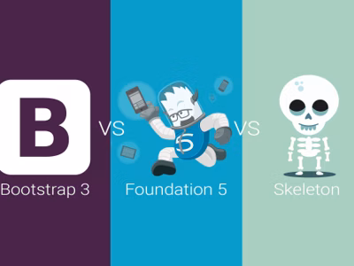
Bootstrap
The most popular CSS framework, developed by Twitter creators.
Features:
- Responsive 12-column grid
- Rich set of UI components
- JavaScript plugins
- LESS/SASS support
- Extensive documentation
Foundation
Framework with “mobile first” approach.
Features:
- Configurable grid
- Advanced mobile features
- Responsive tables and media
- SASS support
- Interchange - loading different resources per breakpoint
Skeleton
Minimalist framework based on the 960 Grid system.
Features:
- Fixed width 960px
- 16 columns
- Very lightweight (~400 lines)
- Good starting point
How to Choose?
| Need | Recommendation |
|---|---|
| Grid only | Simple Grid, One% CSS Grid |
| SASS/semantic | Bourbon Neat, csswizardry-grids |
| Full framework | Bootstrap, Foundation |
| Minimum code | Skeleton |
Semantic Code
Lighter frameworks often use a semantic approach:
<!-- Instead of Bootstrap classes -->
<div class="col-md-6">...</div>

<!-- Semantic SASS mixin -->
<article class="main-content">...</article>
.main-content {
@include span-columns(6);
}Summary
Grid choice depends on project scale. For simple sites, a lightweight framework is sufficient; for web applications, Bootstrap or Foundation works better.

